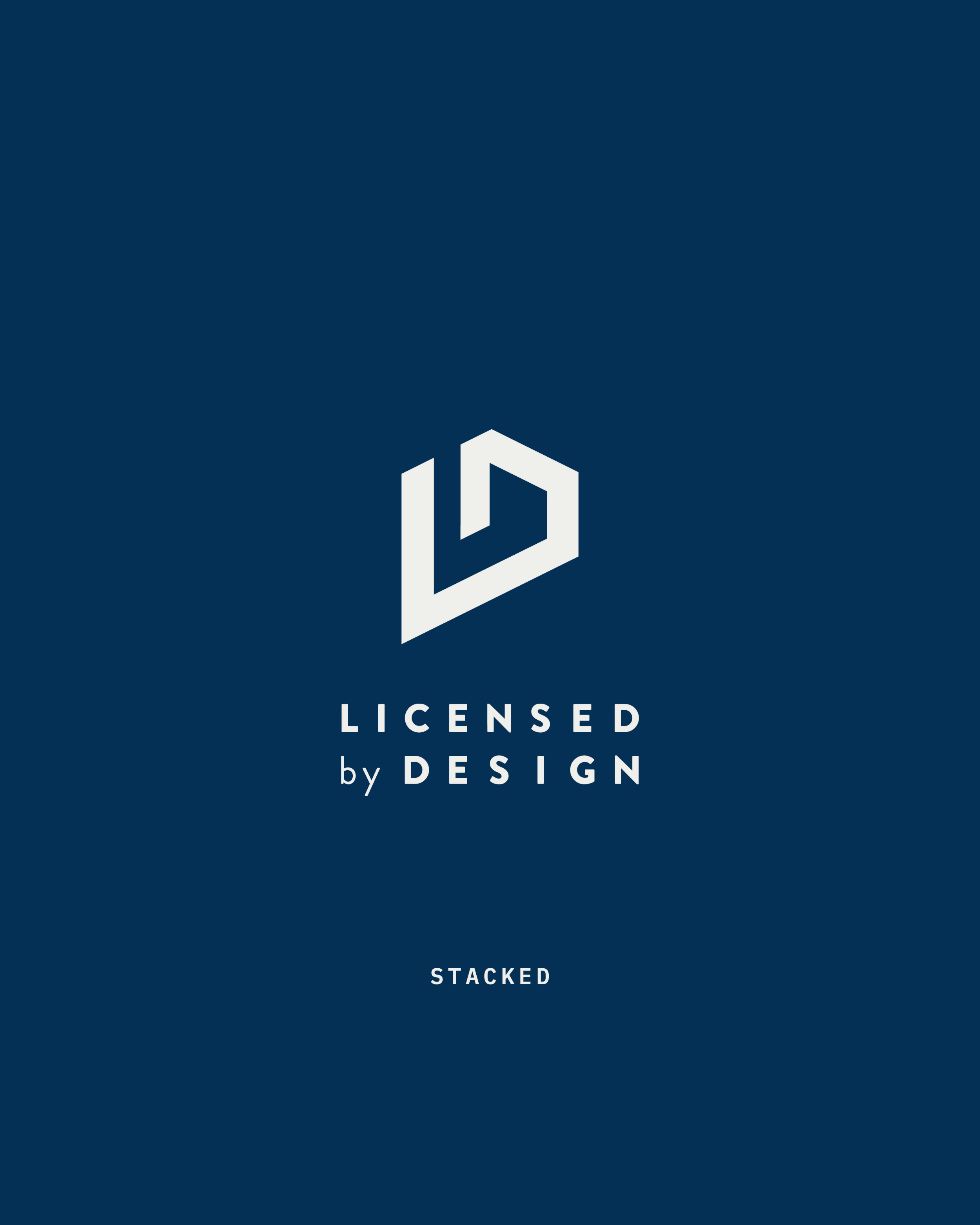
Licensed by Design
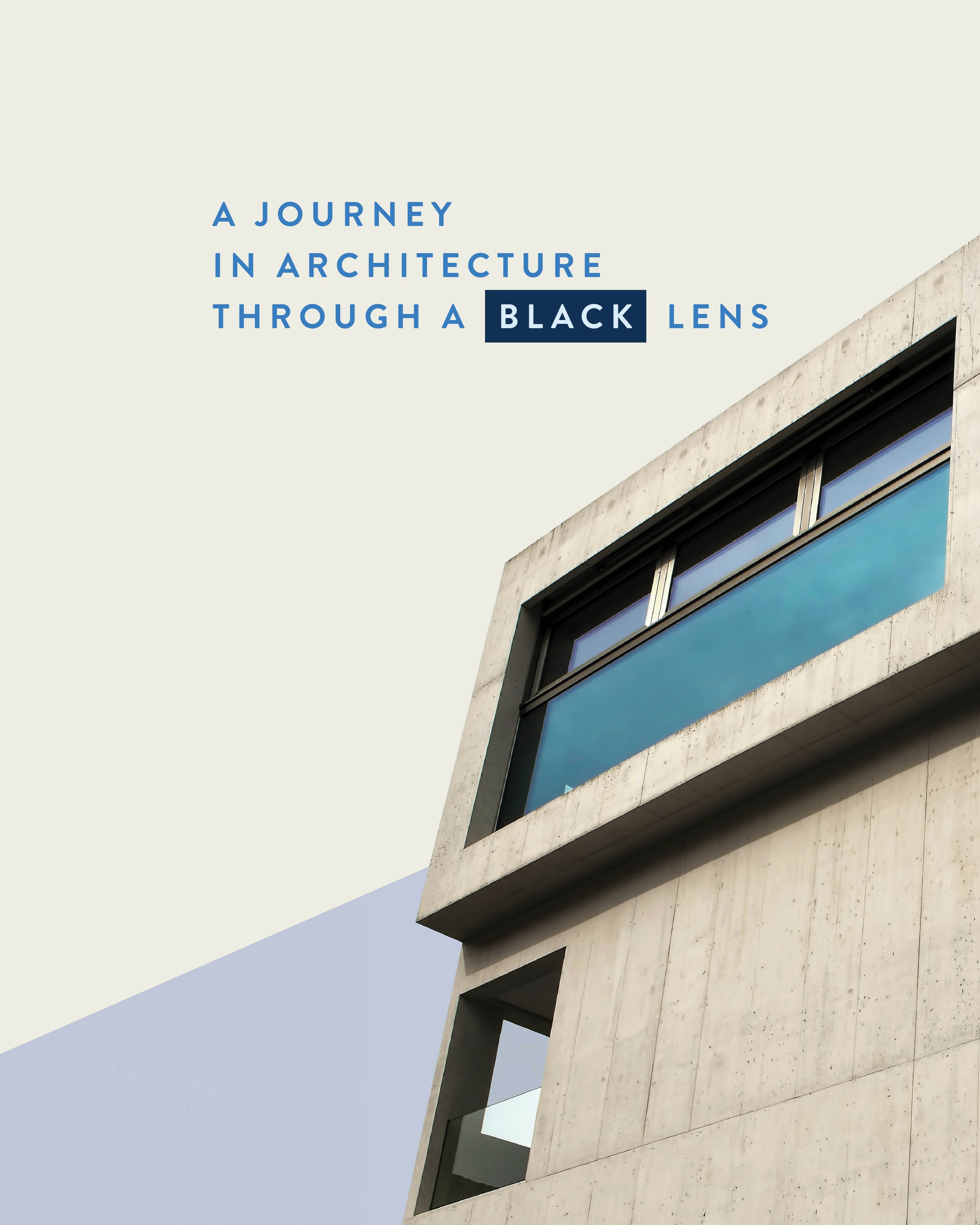
A nonprofit organization that is passionately dedicated to reshaping the narrative of the architecture profession through a minority/African American lens.
Through advocacy, education, and community engagement, they are committed to building a more equitable and enriched architectural landscape that reflects the richness of our collective experiences.
-
Striving to strike the balance between reinforcing architectural elements and seamlessly merging the letters L + D.
-
Incorporating cues from architecture and elements reminiscent of blueprints/symbols associated with the architectural design process helped establish a visual connection — achieving instant recognition.
This thoughtful approach not only lends a unique aesthetic to the brand but also communicates a message of strength, innovation, and strategic vision, aligning your visual identity with the foundational principles of architectural design.
-
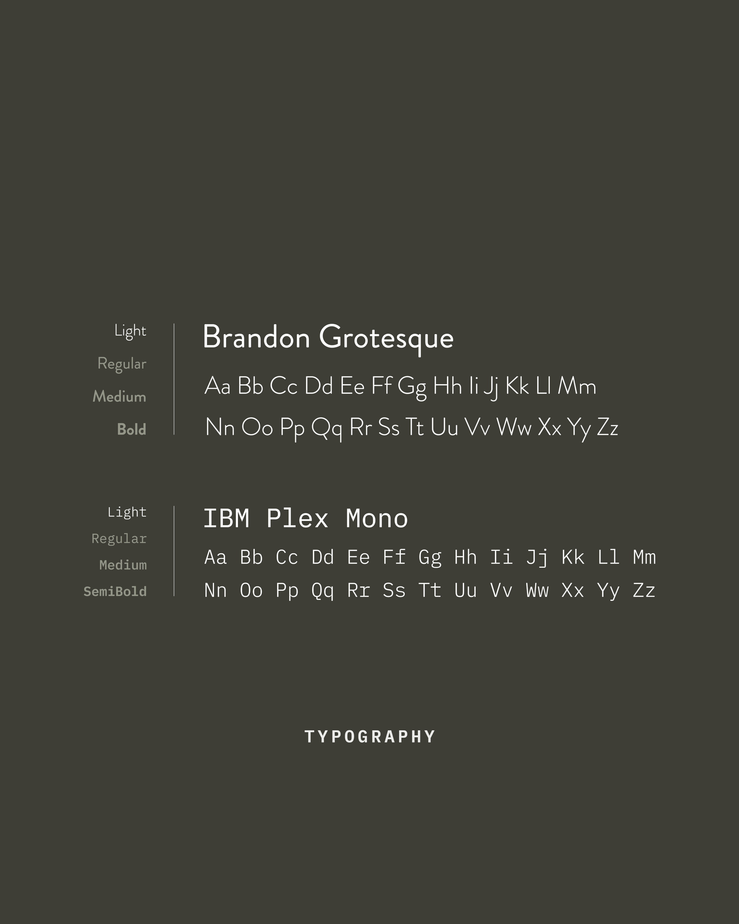
The official typefaces for the visual identity system are Brandon Grotesque and IBM Plex Mono. The aesthetic of these typefaces impacts the overall form and function of our visual brand.
In selecting typefaces for the logo, opting for an aesthetic that is sleek and modern — seamlessly complementing the architectural elements, buildings, and merged letters. Ensuring a cohesive and sophisticated visual identity that resonates with both precision and design.
-
The accompanying imagery features clean lines, dynamic perspectives, and an interplay of light and shadow, harmonizing with the architectural cues — creating a visually compelling narrative that reinforces the brand’s commitment to innovation.
Geometric shapes and blueprint/grid lines are used as containers for images and/or texture for visual interest.
-
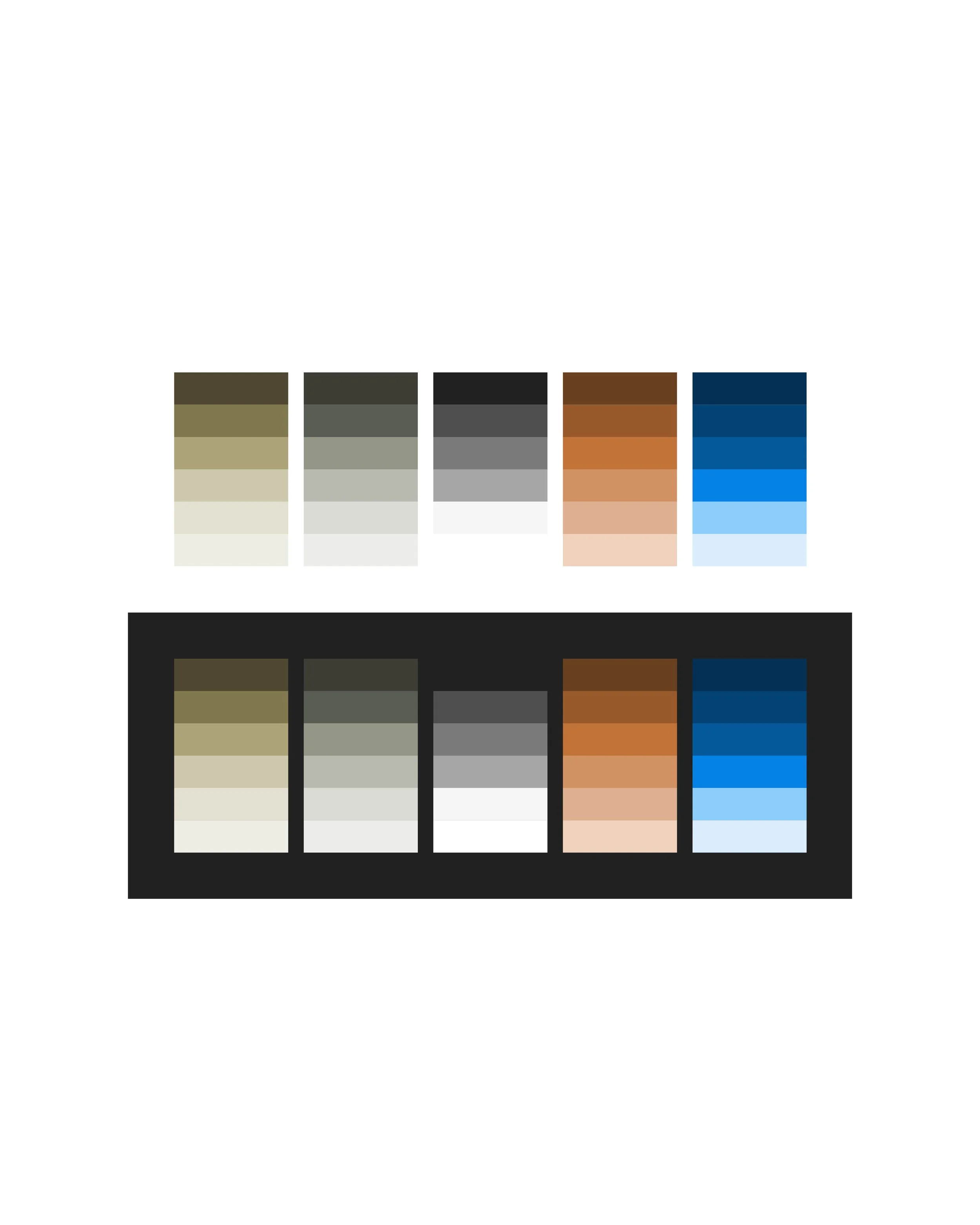
The color palette inspired by muted earth tones and modern neutrals (tints + shades), harmonizes with the structural architecture elements. These colors will also be paired with netural grays and whtie to create a sophisticated and timeless aesthetic that communicates both strength and approachability.
Accessibility was considered to ensure that there are little to no barriers for anyone interacting with the brand.


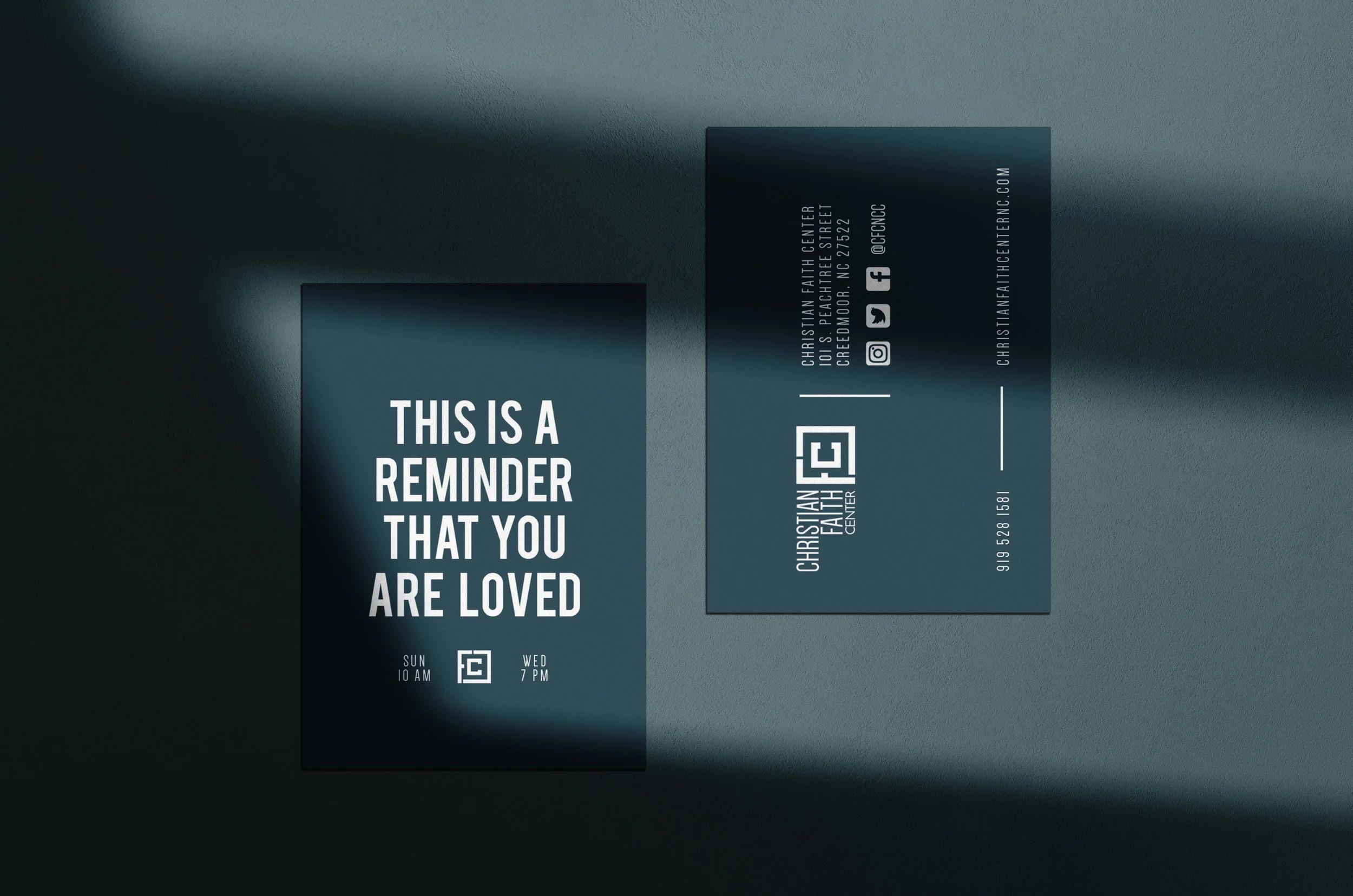
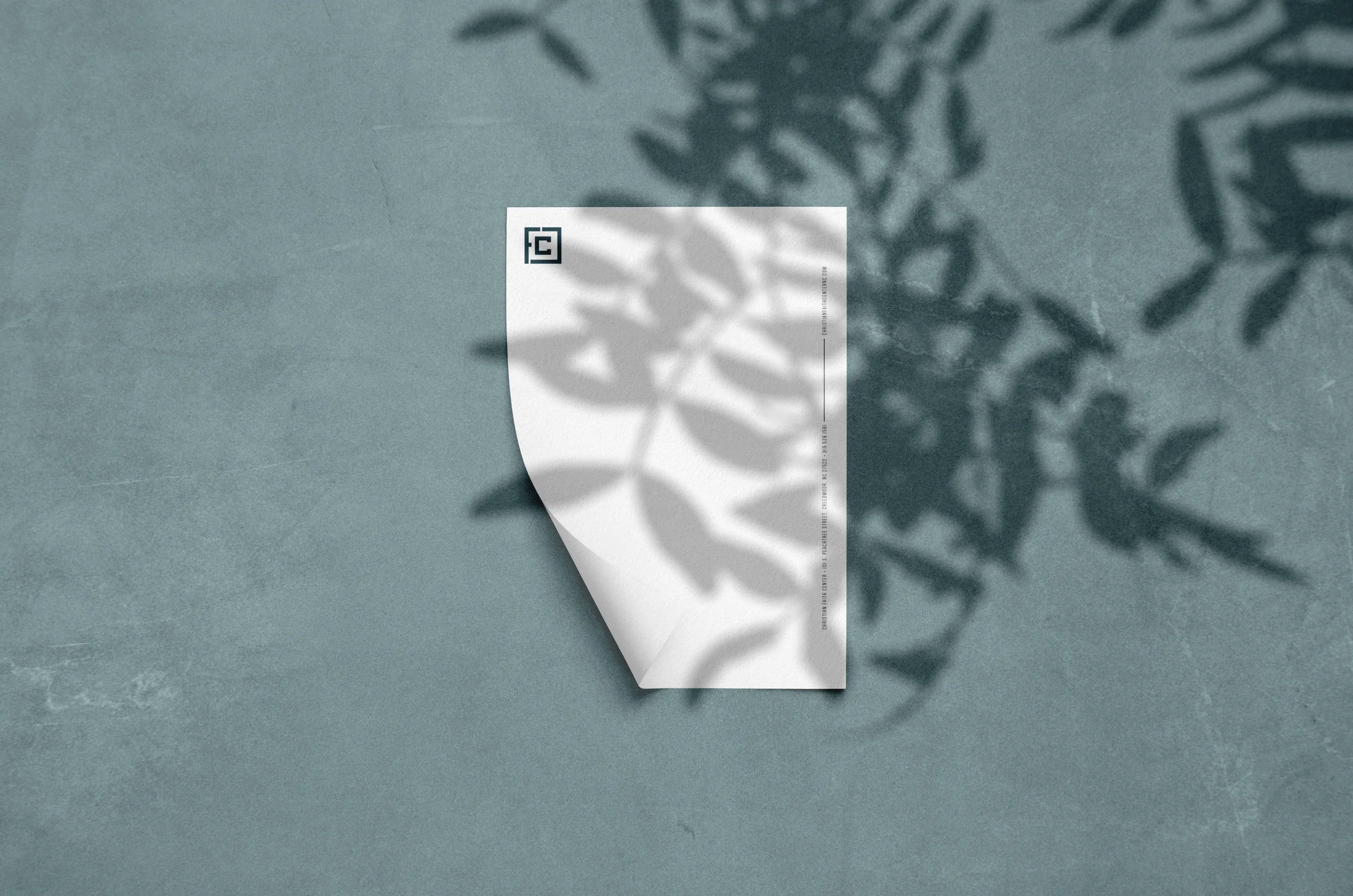
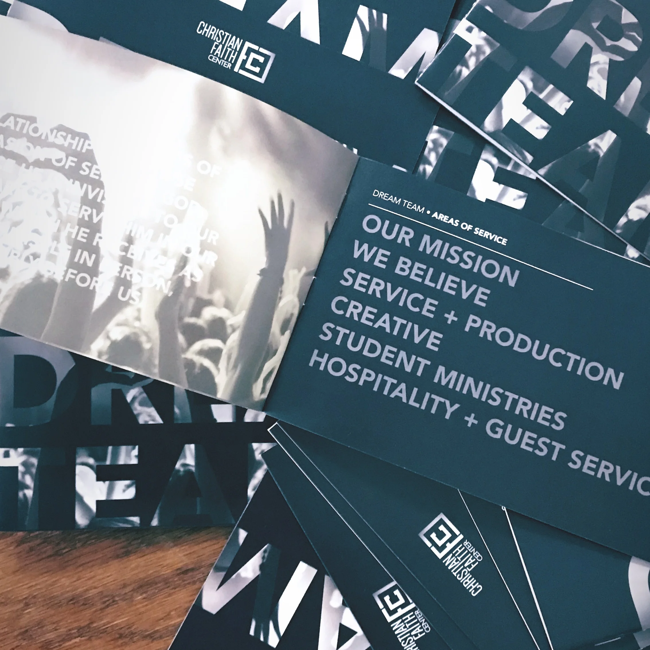
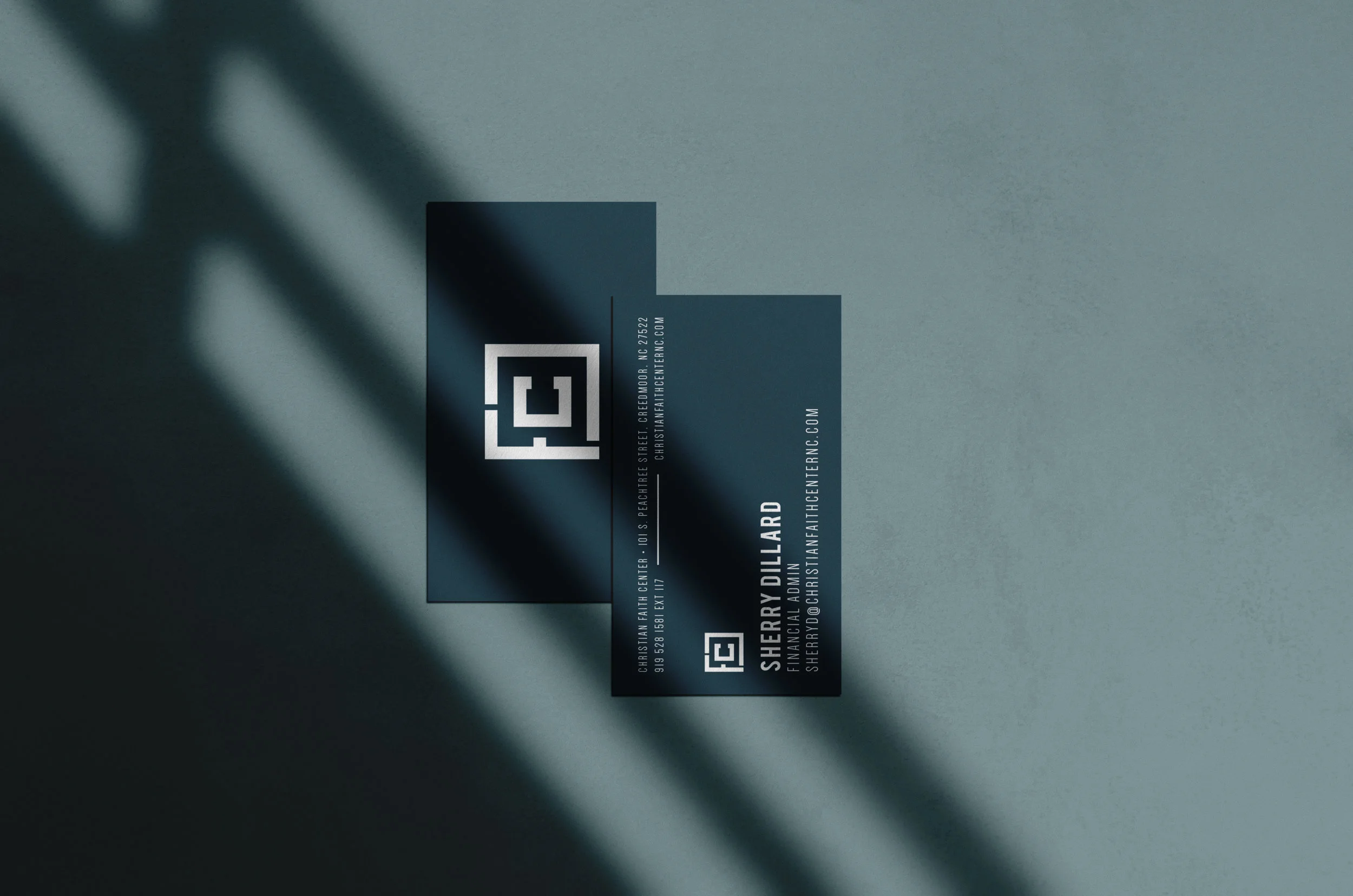
Christian Faith Center
For Christian Faith Center—a community grounded in faith, hope, and love—I designed a set of stationery that reflects their mission of pointing people to Jesus and uplifting the human spirit. The visual elements are clean, welcoming, and purpose-driven, crafted to support the church’s communication with clarity and heart.